Cross-correlation of VLF streams from the receivers is averaged in 5 minute periods. The highest few correlation peaks are examined and arrival time differences of sferics are extracted. These are plotted as hyperbolas with the stronger correlations producing darker lines.
The page will refresh about every 3 minutes. This is a bit experimental so it may not always be working. Check the timestamp at the top of the map.
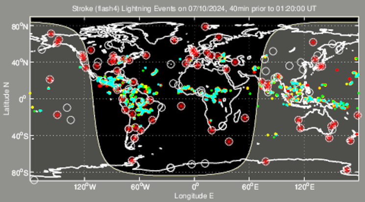
For comparison, at about the same scale is the TOGA map from wwlln.net.